The Roblox ecosystem is huge with over 66 million daily active users of Roblox games worldwide. Out of those 66 million users, 78% of them access Robox through a mobile device. You certainly don’t have to optimize your Roblox game for mobile users but if you want to reach as many players as possible then maybe you should at least consider it.
Updating your game for mobile players, after it’s already done, can be quite time consuming. That’s why it’s important to consider mobile users at the start of game development.
Let’s dive into some things you should consider when making a Roblox game for Mobile.
Mobile First, Mobile Friendly, or Mobile Only?
There are three ways to look at game development when wanting to incorporate mobile users: mobile first, mobile friendly, or mobile only. Each one of these requires specific development considerations and again it’s important to think about this before creating your game to save yourself a lot of re-coding later.
Mobile First
When you take the path of Mobile First development you envision that most Roblox players who access your game will be on a mobile device.
The User Interface (UI) elements will be minimal and laid out to optimize screen space on a mobile device. When you test your game in Roblox Studio you will be using the emulation device settings so you know exactly what an iPhone, Android, or tablet user will experience.
Interactions between your game world and other users will be based on the experience on a mobile device.
This is not to say that PC players are unwelcome, but the game mechanics remain simplified for the mobile audience. Using a PC doesn’t provide any competitive advantage.
Mobile Friendly
While a game might be developed mainly for a PC player, the developers still consider the user experience of the mobile gamer.
The UI elements of the game may change slightly between PC and Mobile to take into consideration of the lack of screen real estate.
Some game elements might need to be modified for a mobile audience. When talking about UI elements this is referred to as context-based UI. This could mean picking up an item on a PC would show the user pressing the letter “T” while on mobile a button appears close to the thumb positions.
Another game element to consider could be walking on a narrow part and making a jump at the end. This might be easy on a PC but very difficult on a mobile phone. As a developer, you’ll need to balance this to make sure your game isn’t too difficult for one device over another.
Overall the general user experience should be a positive one when accessing your Roblox game on mobile, but it can still be optimal to play on a PC. I can think of several First Person Shooter (FPS) games where you have an advantage on PC but mobile players can still have a good time.
Mobile Only
You could make your Roblox game only accessible to mobile players. In fact, when making your game you have the option to choose one or many of the playable devices available to users: Computer, Phone, Tablet, Console, or VR. By default you have Computer, Phone, and Tablet selected.
While going this route does limit your player base, there could be some benefits. You’d only have to worry about one user interface and one user experience. That could ease your development.
While I don’t think this is the best option for most games I can see certain use cases where this could be ideal. Maybe you have a very competitive game and if someone used a computer they’d have an advantage. Although it is important to keep in mind that not all mobile devices are created equal. Screens are bigger on some phones and you should also consider tablet size.
Mobile Orientation
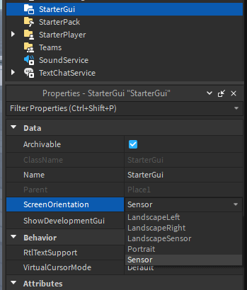
When you make a Roblox game for mobile you need to consider how a player will be holding their phone. Do you want a player to experience your game via landscape (hold phone long ways), portrait (holding phone upright), or does it not matter?
Most mobile games are optimized for landscape. This gives you the most screen real estate to work with. This also is more comfortable for a player’s hands during the play session.
You can force a user to experience your game using a specific screen orientation. You can do this through a LocalScript or directly in Roblox Studio as a property of the StarterGui within the Workspace.
In most cases, I think it’s good to force a user into a specific orientation. Doing so allows you to build one mobile user experience instead of having to spend development time on two.
Reserved Zones
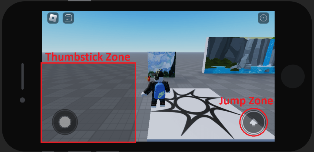
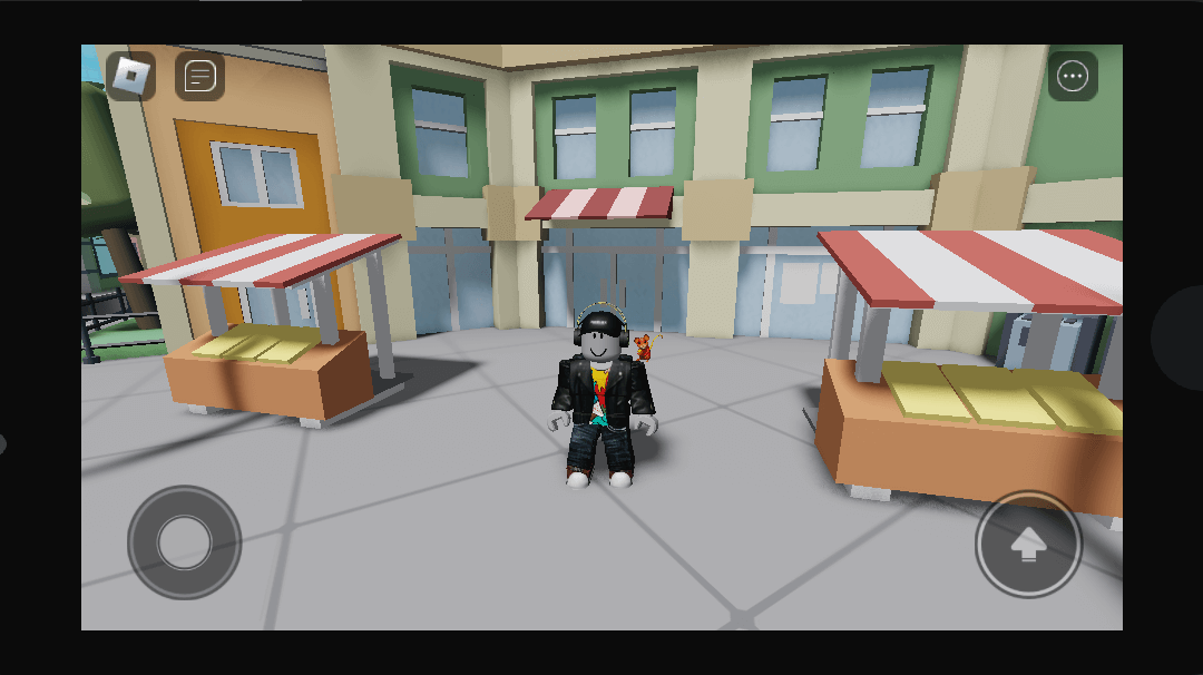
When you play a Roblox game on a mobile device you will notice two screen elements that are not there on Desktop, a joystick and a jump button. These items represent reserved zones.
You want to make sure that your UI elements do not overlap these reserved zones because it will have a negative impact on the user experience. A button right on top of the Jump Zone will not be clickable and will frustrate the user.
The easiest part to mess up is placing UI elements in the thumbstick zone. While you may only see the thumbstick at the bottom left, in actuality a player can move that thumbstick over halfway up the UI to move their character forward.
This is why it’s so important to test your game using the mobile emulator or simply launch it directly from your phone to test.
Thumb Zones
Once you decide to make your Roblox game accessible to mobile users you need to think about button placements in relation to thumb zones. As mentioned in the Reserved Zones section, Roblox has default positioning for the thumbstick and jump zones. These locations are based on where a user naturally keeps their thumbs.

Image Credit: Roblox

Image Credit: Roblox
These images come directly from the Roblox documentation and beautifully illustrate comfort zones for phones. You’ll want to place buttons near the green areas so users can easily reach them. Anything in the red zone and the user will have a hard time selecting it. This will create a poor user experience.

Image Credit: Roblox

Image Credit: Roblox
Keep in mind that the comfort zones differ between phone and tablet. Placing a button 30% from the top is fine for mobile but because unreachable on a tablet. As previously mentioned, be sure to test your game using the built-in emulator to make sure your UI is good across devices.
Movement Modes
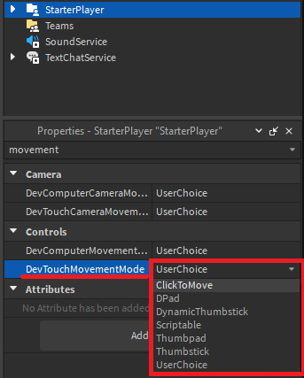
Roblox offers flexibility for developers to choose how a player moves within a game and this can be useful when developing experiences for mobile. This is another option within the StarterPlayer. For mobile, you change the property DevTouchMovementMode. For computer you change the property DevComputerMovementMode.
| Option | Description |
|---|---|
| ClickToMove | Users move by tapping (or clicking on computer) on the screen. The player’s character walks to the target location. When using this mode the jump button is also available in the bottom-right of the screen. Additionally, the automatic jump feature is always active in this movement mode. |
| DPad | This option has been removed from the Roblox mobile app and should not be used for production-ready experiences |
| DynamicThumbstick | Default setting for mobile users if UserChoice is set. As shown in the Reserved Zones section, a thumbstick appears on the lower left and a jump button appears on the lower right of the screen. The player moves by moving the thumbstick. |
| Scriptable | Disables all default controls and allows you to script your own control scheme. |
| Thumbpad | This option has been removed from the Roblox mobile app and should not be used for production-ready experiences |
| Thumbstick | A thumbstick appears in the lower left of the user’s screen in a static position that doesn’t change based on where a user touches. |
| UserChoice | Let the user decide their own control scheme from the in-experience Settings menu. This is the default setting when creating a new game in Roblox Studio. |
Automatic Jumping

When a player accesses a game from a mobile device the game, by default, enables auto jumping. This means that when a user reaches a gap or an object tall enough to block normal walking movement, the player’s character will automatically jump.
Depending on the type of game this feature can create a smooth user experience. However, if you want the users to only be able to jump by using the jump zone button in the lower left corner of the screen then you can disable this feature.
UI Layout Scaling for Mobile
When designing your game to be played on more than one device you need to think about how UI elements are laid out. Even if you are developing for mobile-only you will still need to consider phone vs tablet.
We’ve already discussed areas you should avoid and the comfort zones of a player’s thumbs. We also discussed the importance of testing using the phone and tablet emulator.
One thing we haven’t discussed is some of the settings you need to use when adding ScreenGui’s and Frames to your game. While this could be an entire article I will let you know the most important point here.
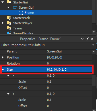
When you add a frame to your game, by default, it uses Size: Offset which means it will be scaled in Pixels. The reason this is bad is because the pixels of each device are different. That means that a GUI element will look different on an iPhone, Android, tablet, or Computer.
To resolve this you need to use the Size: Scale instead of Offset. Now it’s sizing elements relative to your screen which means elements should stay consistent between devices. So once you add a new GUI element such as a frame it is a good idea to change the size to {0.1,0},{0.1,0}. Now when you click and drag to re-size the element it will keep its relative size instead of saving based on pixel size.
Plugins for Mobile UI Development
First I want to say that when creating a UI for mobile you do not need any plugins. However, I wanted to include this one since I found it helpful when I was first starting out and maybe you will too. Also, this plugin is still free.
The plugin is called AutoScale Lite. It’s very easy to use but what’s even better is there are great tutorials for the plugin so you can understand it in a matter of minutes.
There is an official forum post detailing how to use the plugin or you can watch a YouTube video.
So, what does the plugin actually do? It changes the scale of a GUI from Offset to Scale and can add a constraint so everything keeps its scale regardless of the screen resolution. Once again, you can do both of these manually and you do not need this plugin to create a mobile-friendly UI. But if you do choose to use a plugin, this is a good one.
How To Make A Roblox Game For Mobile
Making a mobile-friendly Roblox game isn’t difficult but it does take some consideration as we’ve outlined in this article. Using this information you will be able to make the necessary design decisions needed to create a great mobile user experience.
While you need to make some UI updates and possibly think through some game mechanics, in general creating a game for mobile or computer users is very similar.
If you’re new to the world of making games for Roblox you can check out our free course on building your first Roblox game. If you’re already far into your development process and ready to publish we also have an article detailing the full experience of publishing your game to Roblox.
 Learn Roblox Studio